Showing posts with label Graphic Design. Show all posts

Sunday, December 27, 2009

Cartoony Minimalism


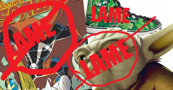
The best way to follow an exceptionally lame post about such boring topic as shadows I might as well go ahead in my search for blog fame by insulting someone or possibly a whole (sub)culture. Recently there was produced a line of shoes for D&D. Instead of something looking completley bad ass, they decided that the best route was something completely lame. They say you're not a star wars fan until you have livid hate for one of the films, and my hate lays upon the terribly ugly Clone Wars. Spawn as well has been blasphemed with this similar mess, the adventures of spawn.

It’s merely a matter of taste, and where better to house one’s tastes than extremist elitism. I’ll just go out and say it: I have a apprehension or strong dislike towards anime or manga or whatever bullshit you want to name it. Sure there’s been a few keepers out there, but I dare not name them and suck us into some tangent – let us focus on the point. I hate the style and not just strictly anime but more some of the terrible siblings I loosely and possibly incorrectly blame for creating. Any style that has some bug eyed, cutesy cartoon child-appealing minimalism needs to be stripped, raped and strangled, and not exactly in that order and more so with some metaphorical paint brush that will turn this disneyfied ass hattery into something that destroys retinas, minds possibly souls and most hopefully trends, codes, conventions and norms.

As stated its merely a matter of taste. From a point of studying graphic design, everything has its place, its seat – everything has its season. As I learn and make more mistakes and drive my foot mouthward, I can admit this “cartoony minimalism” can be used and done. In context this can be done well. There is a different approach for whatever idea is being executed. Whatever you’re selling, whatever you’re depicting it deserves the proper approach that evokes and speaks the core of that idea.

I was inspired to write this very rant from my emotional response to a thread on some forum depicting a version of this cartoony minimalism. I didn’t run in and start insulting everyone because that’s poor form. In hindsight I don’t have too many insults left over except to the style in and of itself.

Sometimes cartoony minimalism, it works! The images do show certain levels of expression, emotion and interest. Being used for a web comics which is the intention, it can work! In this medium, it can work really well. Penny arcade has been doing some really well done and really well executed “web comics” that really are escaping their medium. Their execution of cartoony minimalism works really really well, so well it escapes its’ medium. That is good execution, that is well placement. That is how graphic solutions should be done.

All in all I hate this direction and hope to no longer see people produce this work and use it to represent D&D. I hope to look and critique further into how D&D is presented to the world, and I feel someone in the marketing department has been making some terrible mistakes, or at least one: the goblin stompers.

What do you think of Cartoony Minimalism? Do you like this? Do you like D&D being represented by this?

Monday, December 21, 2009

The Shadowed Edge

The final project of the semester came down to a five day hell of creating a website. I literally stopped to take short naps over a weekend and a couple days. I quickly learned how my profession as a graphic designer can have it's challenges when crossing between mediums. This case being from print to web.

A big difference between web and print is that of gradients. In print we're told and I agree that gradients are a big taboo thing. Maybe there's some room for argument that they can be done tastefully. Usually the result is something that looks like a those god-awful-club-cards. Gradients in print don't work usually because they lack an organic feel.

When you move to web though - gradients are tool of the trade. Web is rarely organic. They're used to really give a presence to text, a sort of depth to imagery and design. Really, what gradients do is a good job of polishing a web design off. Giving it that finished look.

Check this website, link given to me from a teacher. It has great tips about the cleaning off and finishing of a web design:

http://psd.tutsplus.com/designing-tutorials/elements-of-great-web-design-the-polish/


One thing I've noticed in design regardless of the medium - whether its an print ad, a web page, or an illustration is the shadowed edge.

A shadowed edge works in taking away a flat feeling from the design. It works in giving a good feeling of depth and somewhat a feeling of warmth. That little glow. It also works in bringing the attention, drawing the eye into the piece. It's a very directive tool.

Here on the right is a couple stages in on a design, the final product not really showcasing the shadowed edge. I didn't really do it too strongly, but the shadowed edge is there.

When it comes to print though it's entering that taboo I mentioned earlier: the gradient. In this medium I think it works because its an actual mock-element of an organic thing (shadows) and the focus isn't on the gradient. It's pushing the eye away from itself entirely.

When it comes to the shadowed edge though - how far is too far?

When has the design world become too saturated and a new direction is needed?

Please take a look at http://dndcraft.com/ It actually has a lot of cool stuff and a community of excellent artists.

This site looks good, it looks excellent in fact. In being a D&D website it stands out even more as many D&D related sites are poorly designed.

Looking at it though the question haunts me, is this overkill? Has the shadowed edge been overdone? Something seems almost glitchy about it - though it follows a lot of the so-called-rules of thumb that are laid out in properly approaching a web design.

I would really pull back a bit. Don't get me wrong - it looks damn good. It's an A + project.

The question I would love to explore is how far is too far?

As a designer and anyone else who likes to put together things with a bit more of a professional appeal what are your feelings on the shadowed edge?

Have you seen too much of it? Does it have its place?